퍼블리싱
[CSS]마우스 호버시 아이콘 모양 변경(사이드바 보기/감추기역할)
lionbum
2024. 6. 19. 14:03
주로 사용된 css
transform
:hover
1. html
<div class="arrow">
      <div class="icon-wrap">
          <div class="icon">
              <div class="line"></div>
              <div class="line2"></div>
          </div>
      </div>
  </div>
2. CSS
.arrow {
  z-index: 999;
  top: 50%;
  left: 0px;
  position: fixed;
  transform: translateX(100px) translateY(-50%) rotate(0deg) translateZ(0px);
  transition: transform .3s ease-out;
  cursor: pointer !important;
}
.arrow .icon-wrap {
  justify-content: center;
  align-items: center;
  width: 2rem;
  height: 72px;
  display: flex;
  cursor: pointer;
  transition: transform .3s ease-out;
  z-index: 99;
}
.arrow .icon {
  align-items: center;
  flex-direction: column;
  width: 34px;
  height: 33px;
  display: flex;
}
.arrow .icon div {
  border-radius: 100px;
  width: 4px;
  height: 34px;
  background: #999;
  transition: transform .2s ease-out;
}
.arrow .icon div.line {
  transform: translateY(2px) rotate(0deg) translateZ(0px);
}
.arrow .icon div.line2 {
  transform: translateY(-2px) rotate(0deg) translateZ(0px);
}
.arrow:hover .icon div.line {
  transform: translateY(2px) rotate(20deg) translateZ(0px);
}
.arrow:hover .icon div.line2 {
  transform: translateY(-2px) rotate(-20deg) translateZ(0px);
}
.arrow:hover .icon div {
  background: #222;
  cursor: pointer;
}
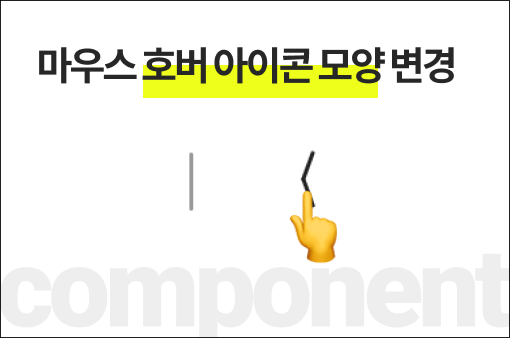
결과 보기
마우스를 호버해 보세요!
728x90
반응형